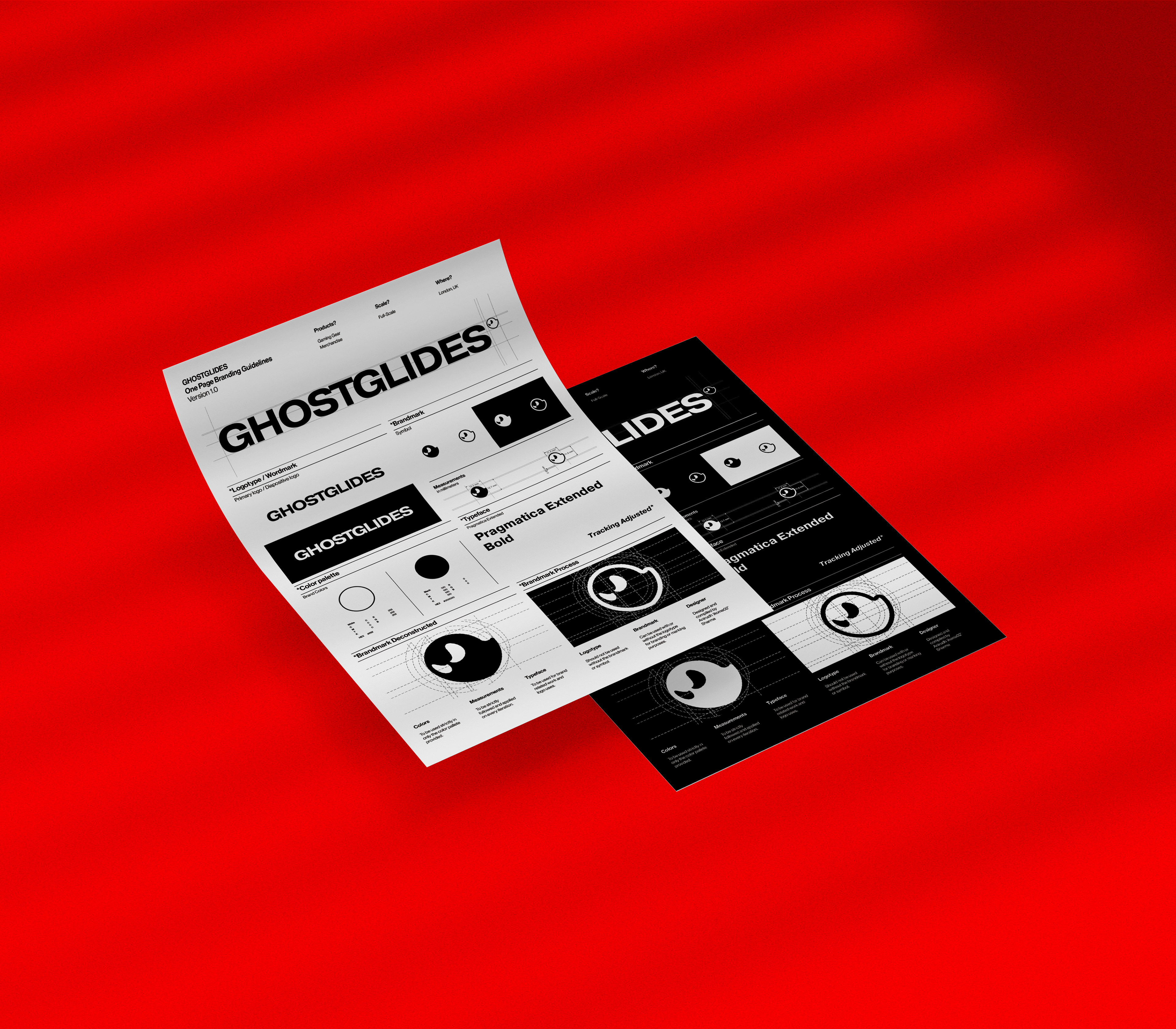
Ghostglides Re-Branding
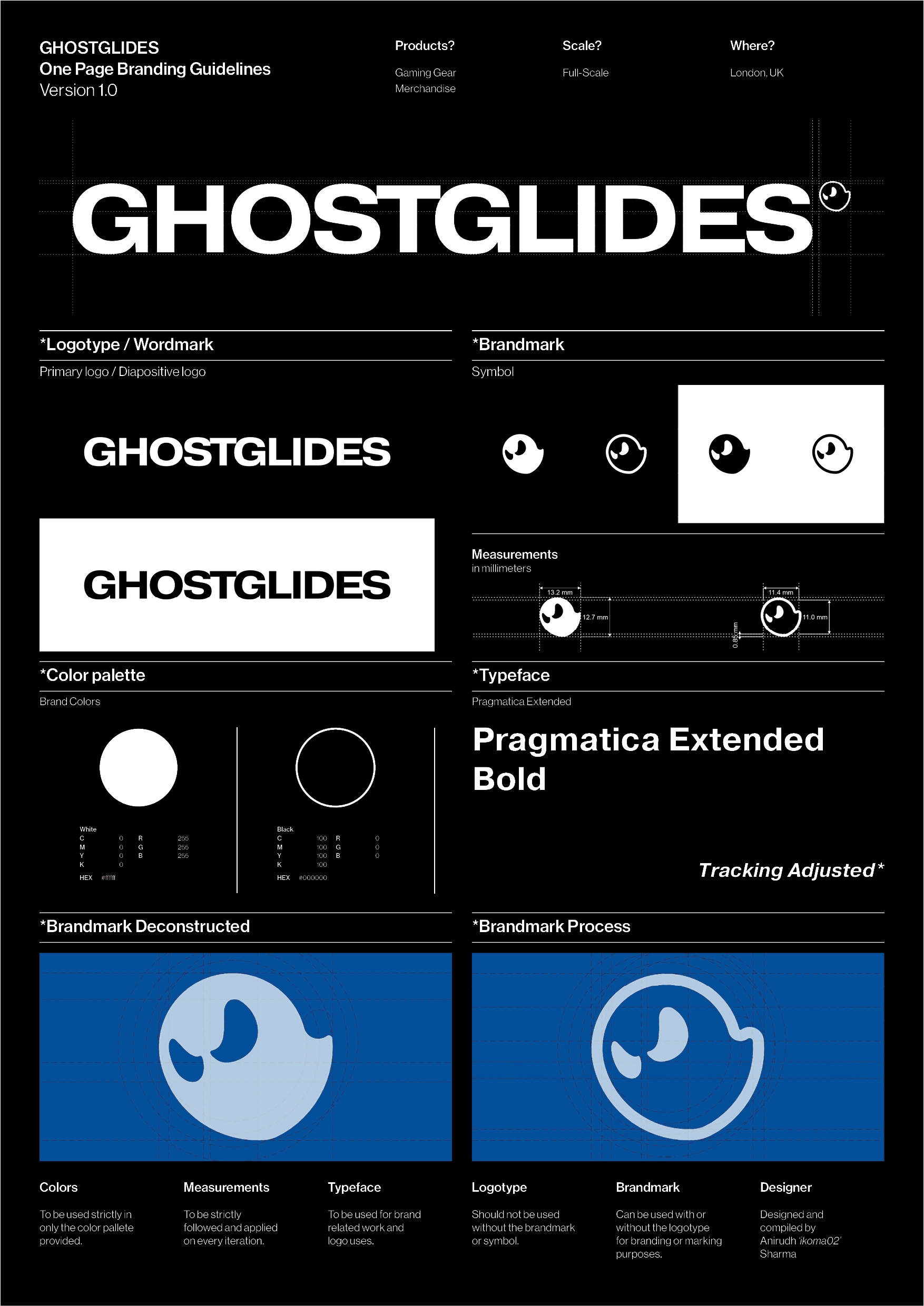
The Rebranding process was needed as the branding had only been the name written in a specific typeface, client needed a symbol or a small minimalistic styled brandmark to go with the logotype where usually is the registered mark.
The mark here is a gliding ghost, made using concentric circles and a pair of concentric circles offset from the main set of circles, the mark is bold enough to be used as the small element with logotype and is unique enough to be used individually as a brand-mark.
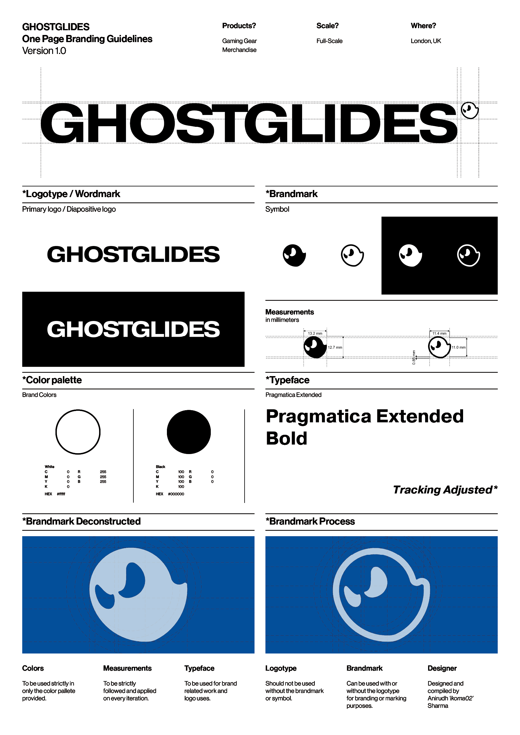
The Branding was to be kept as minimalistic as possible, client already had the vision of a monotonous color scheme and typeface, the brand revolves around only two colors black and white, inspired from the manga, so only two colors of the branding are strictly applied.
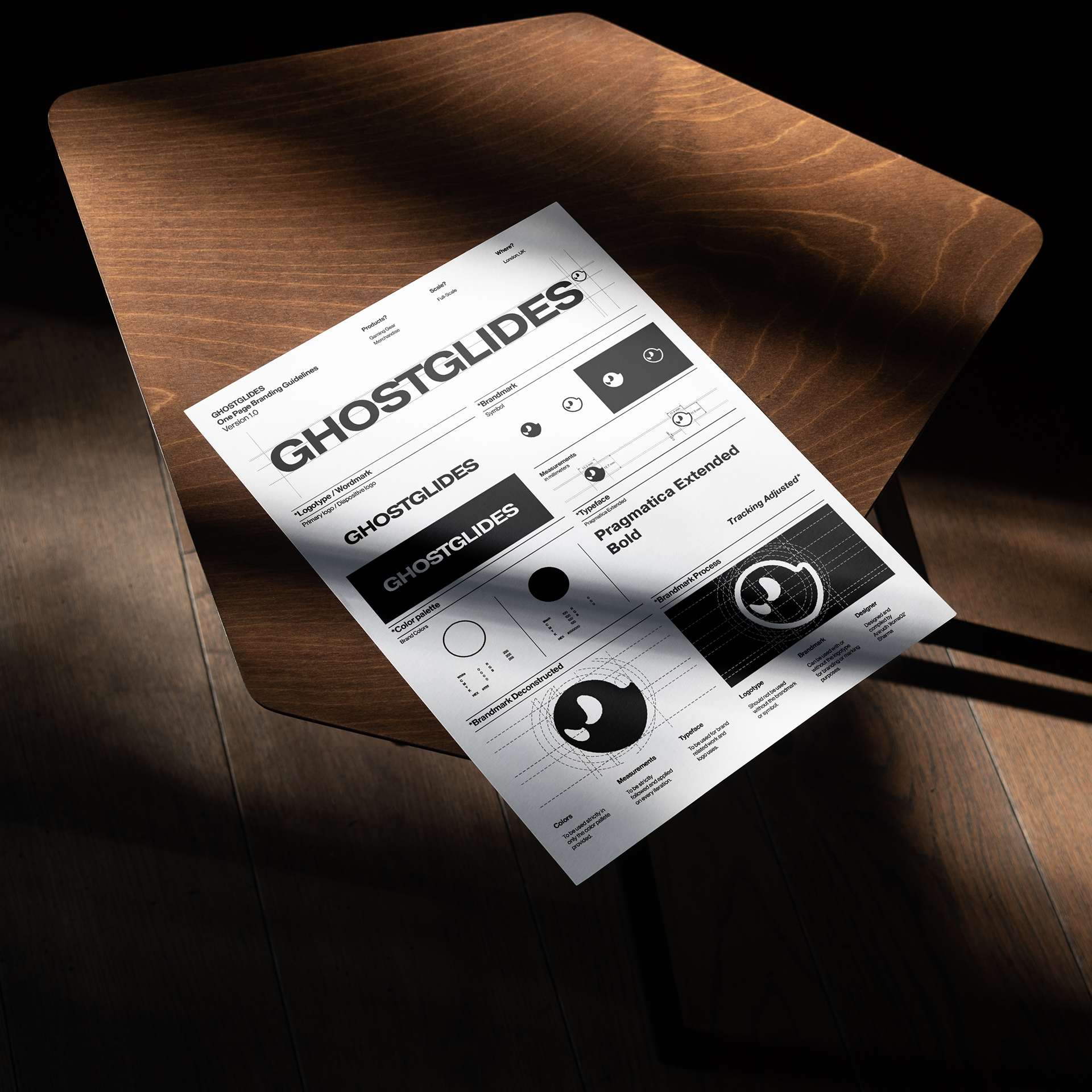
The one page branding guidelines are made on a A3 size page, and can be used as a decorative poster in the main office.